
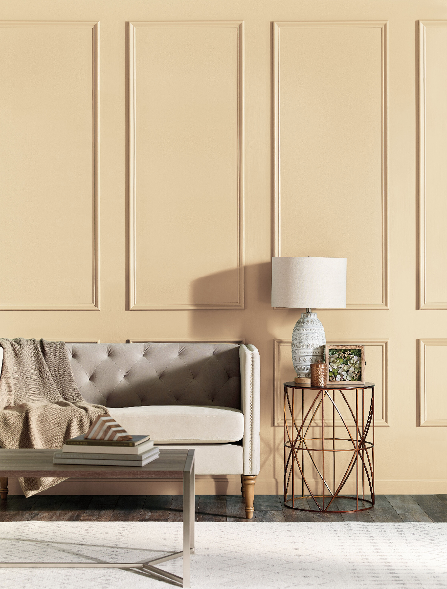
Design inspiration is in full swing. With IDS Vancouver recently kicking off the season and the Vancouver Fall Home Show coming up later this month, style at home is top of mind. An easy (and affordable!) way to give your space a major update without a massive overhaul is paint; tackling a feature wall or a whole room refresh is a simple weekend project and offers up a serious style statement. Looking to what’s going to be on everyone’s must-have colour wish list as we move into 2018, I checked in with a few style experts to see what the 2018 colour trends are looking like. Erika Woelfel, Vice President of Colour and Creative Services at BEHR, speaks to the brand’s recently revealed palette and Colour of the Year, while design darling Amanda Aerin shares her faves from her collaboration with The FAT Paint Company and how she’s loving them paired for the upcoming season.
What were the primary inspiration factors behind the Behr Colour Trends collection?
EW: Each year, our team is inspired by what’s happening in the world around us and how colour comes to life in new ways―in fashion, pop culture, travel, home décor and more. We spend months imagining a palette filled with colours that will reflect what’s to come. This year, we were specifically drawn to lifestyle trends of awareness, mindful living and the Danish concept of hygge―the feeling of cozy, comfortable conviviality and well-being. People are organizing and decluttering to prioritize experiences over material items. They are searching for balance amid their busy schedules, while trying to escape technological overload.
What colours are you feeling inspired by for the coming year?
AA: Sensual earth tones reminiscent of old Hollywood glamour have got me really excited for the season ahead. Colours like deep plum, luscious teals and my paint colour Can’t See Me Camo are all perfect paired with this past seasons pastels. The mix of light and dark give the colour combos strength and presence while feeling luxurious.
What made ‘In The Moment’ the standout colour for the year?
EW: Throughout the process of researching and curating our BEHR Colour Trends, cool, spruce blues popped up at every turn. From furniture to décor to fashion, stylists and designers across industries are finding new and beautiful ways to incorporate this usable blue-green. It’s so versatile, bringing a sense of sanctuary to almost any room―kitchens, bathrooms, dining rooms, you name it! We couldn’t resist giving In The Moment T18-15 the spotlight this year.
Do you have any favourite colour combinations or trends for 2018?
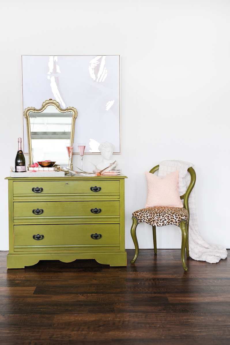
AA: Absolutely! Anything Camo Green Coloured paired with blush-I would love to design a room around these colours with a little gold sparkle thrown in for good measure.
How do you predict the public will connect with and interact with this palette? What feelings do you think these Colours will evoke for people?
EW: The Colour Trends palette is all about the intentional use of colour to enhance the energy of your most meaningful spaces. We hope these 20 new colours will work to create personal sanctuaries, inspiring consumers to relax, disconnect and simply be present. The hues encourage people to capitalize on the positive effects of colour by using it sparingly or generously throughout their home. We often can’t wait to get home and just be―so it’s about choosing colours that allow us to do just that.
What were the driving factors behind your palette collection with FAT paint?
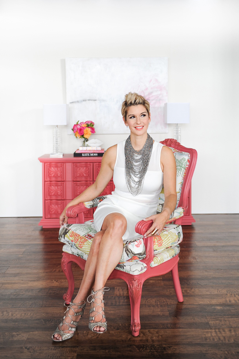
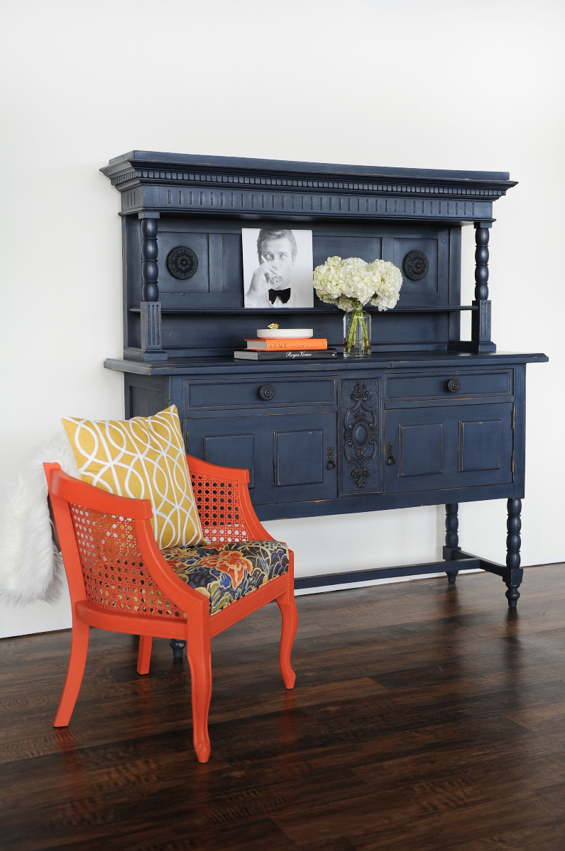
AA: Each of the 6 colours in my FAT Paint collection are inspired by parts of my personality. Blushing Bombshell is the sexy version of my personality while Navy State Of Mind plays homage to by inner girl boss. Orangeapalooza is a party in can sparked by travel to the Caribbean.
What do you feel your clients are most excited about when it comes to colour selection?
AA: Clients are generally afraid of using too much colour but Navy has been a great all around colour for both men and women. I have used it on painted cabinetry, on dining room ceilings and in dining rooms. It’s a timeless colour that packs punch. Navy State Of Mind is my best selling colour.
Comments +