
Designers and décor enthusiasts are jointly rejoicing at this week’s launch of the collaboration between design guru, Amanda Aerin, and local go-to for fabulous finishing treatments, The FAT Paint Company.
New Westminster-based and globally sought-after, FAT Paint has been redesigning the chalk paint industry with its line of paints that are easy to work with in both application and end-appearance customization (their paints are renowned with DIYers for the ability to distress with ease, giving each project its own unique look).
Victoria and Bradford Lambert, the brother and sister duo behind the brand, both hail from creative backgrounds and sought to produce a versatile chalk-style paint by artisans, for artisans. The result has led them from (literally) a kitchen project to a 2,400-sq.ft. headquarters and production space, with international stockists.
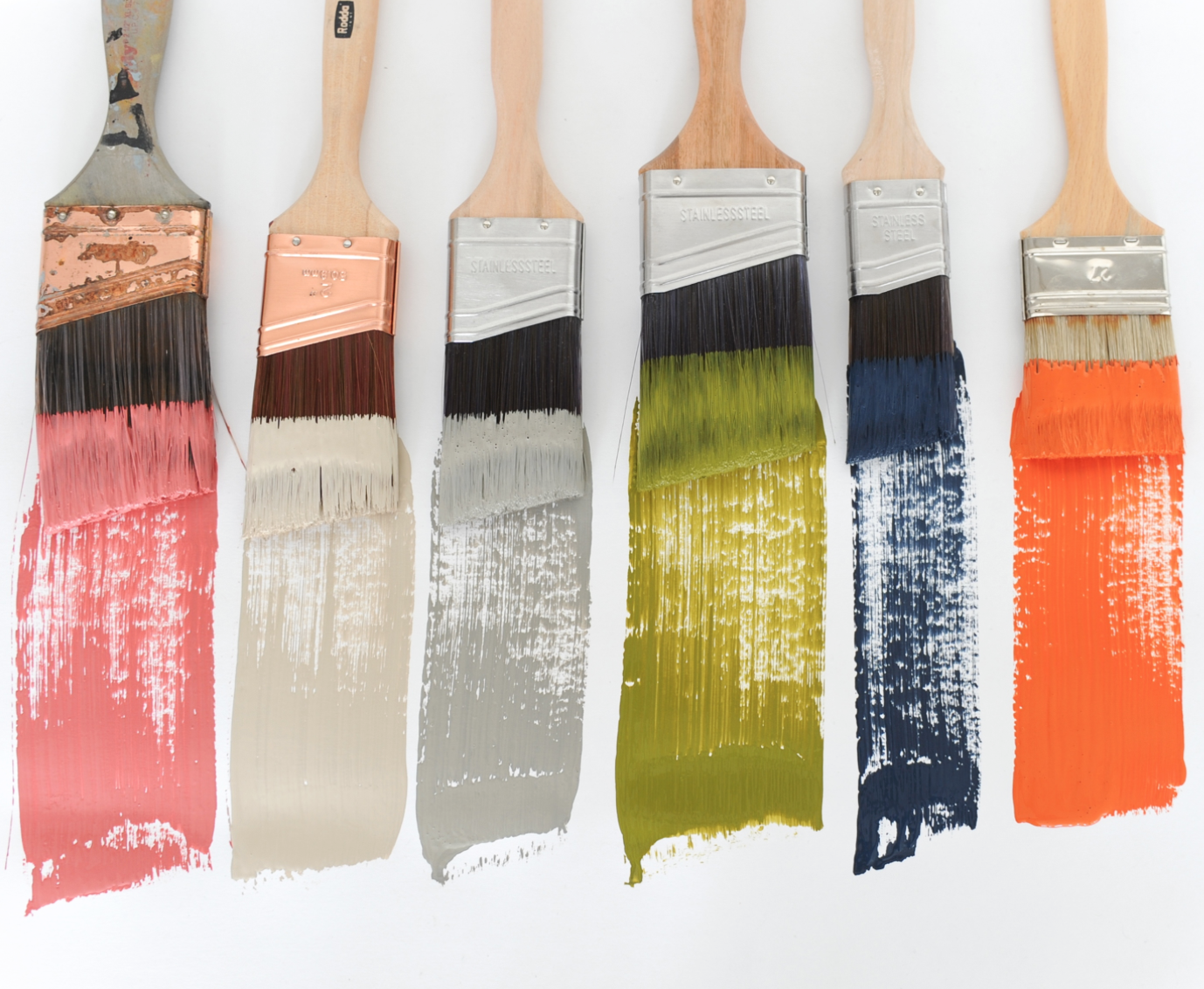
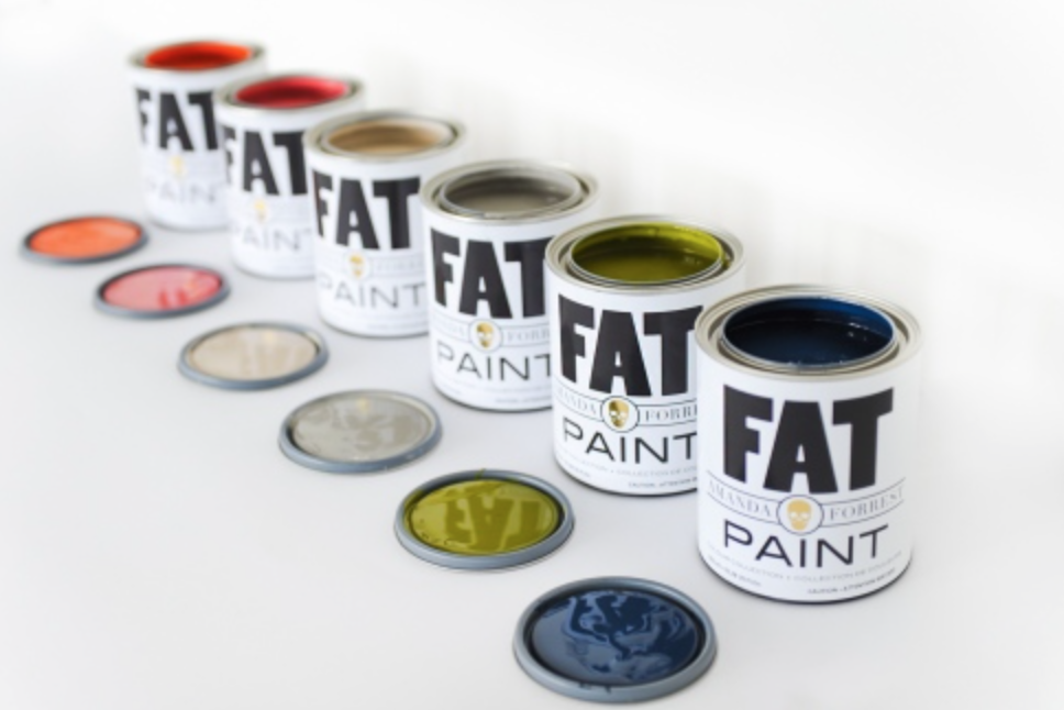
Forrest, who has 15 years of experience reigning as the queen of the Canadian design scene, recently partnered with FAT Paint to offer her edgy-meets-chic twist to their palette. Thriving on the style expertise she brings to the design and lifestyle industries, The Amanda Forrest Collection is comprised of six stunning colours that create a dramatic effect both together and as a solo statement.
What I love best about the fresh line is the notable vibrancy and individuality behind each colour; says Forrest of the collection,“[the] colours are all inspired by my personality and personify my creative drive, passion for business and love of travel”.
The concepts behind each colour are explained below; if your inner DIYer is enticed, purchasing information is available at TheFatPaintCompany.com.
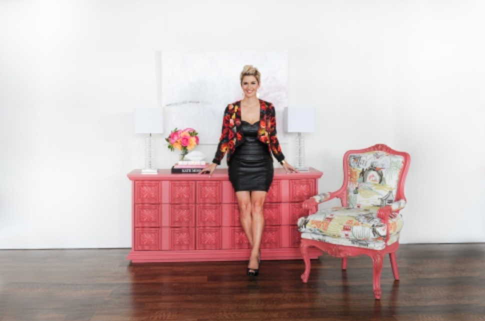
Blushing Bombshell
A fierceful and sensual colour with an incredible drive seeking to be passionately paired with either floral or vibrant patterns.
Tip: Blushing Bombshell commands attention and is best partnered with greens and navy; the perfect colour for a media cabinet, accent tables or picture frames.
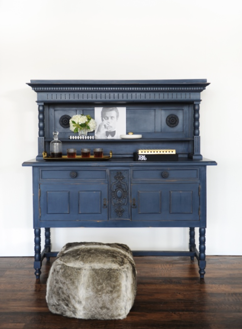
Navy State Of Mind
The boss of her world, strong to the point and always unwavering. As crisp as a pin striped suit and sky high heels.
Tip: Navy State Of Mind is a grounding colour. Its classic hue will stand the test of time on vanities, kitchen cabinetry and any mantle.
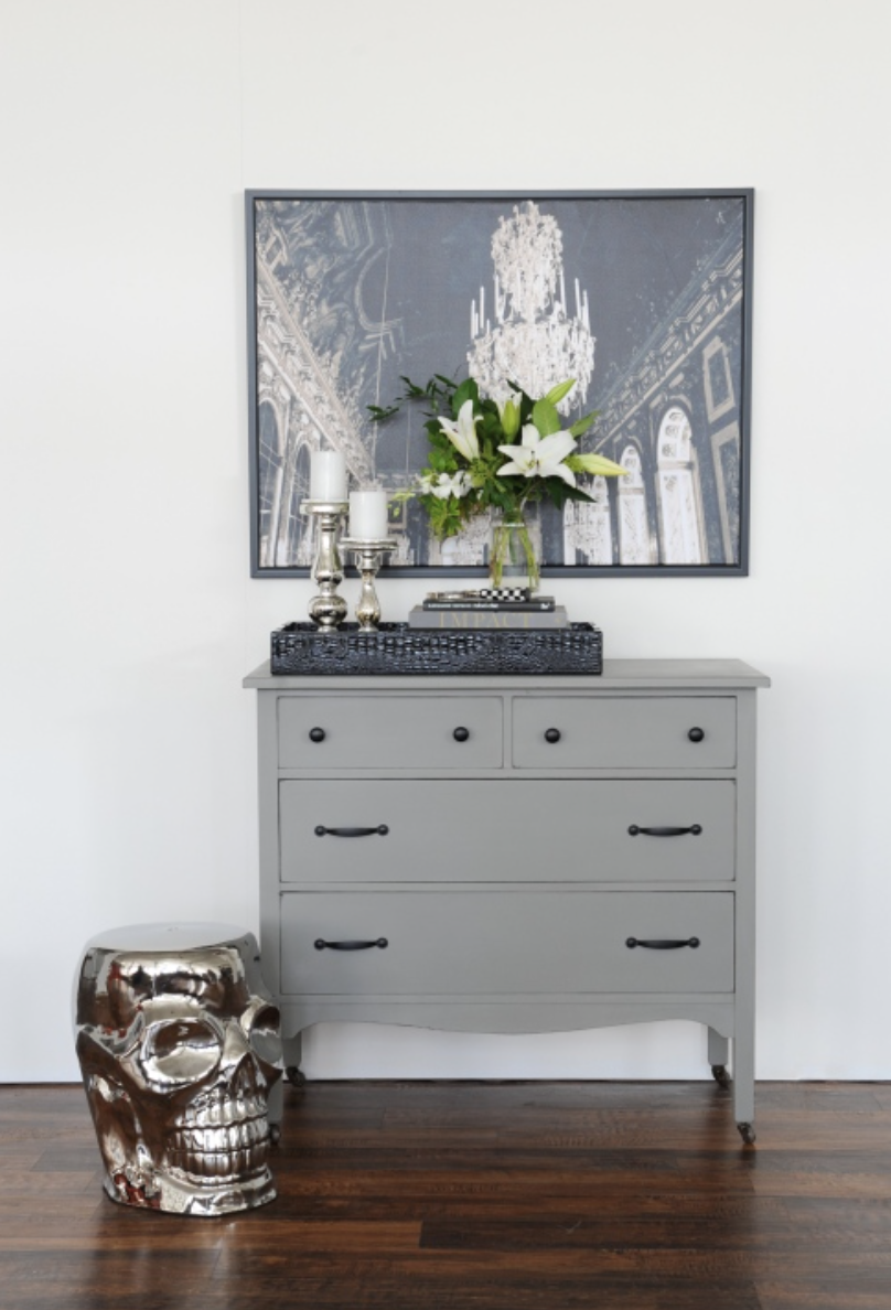
Greysful
She has a quiet soft demeanor only intimates will discover. Its understated elegance is gentle and classic mirroring the lady at heart.
Tip: Greysful speaks to your inner traditionalist. It is the perfect grey to elevate cabinetry, coffee tables and headboards to a new level.
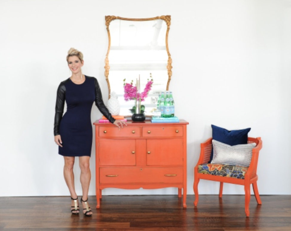
Orangeapalooza
Destined for tropical inspiration with an umbrella drink in one hand and toes in the sand, this shade is as hot as the Caribbean sun.
Tip: The colour of fun, Orangeapalooza’s saturation is rich and deep giving it visual interest to hall tables, dining chairs and table lamps.
Couture Linen
Couture Linen covets fashion and the attention to detail found on a beautifully crafted blazer or a beaded formal gown, knowing what looks best and priding itself on being a well mannered colour even at the nest of social events.
Tip: Couture Linen is a classic tone that will bring out the best in any piece fitting in with any style of décor.
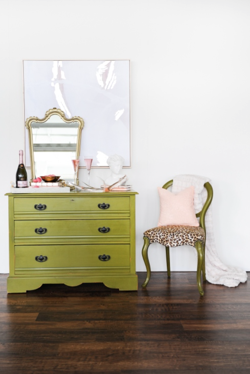
Can’t See Me Camo
She is a real team player with a masculine side. Her ability to lead and inspire through life experience has granted the gift to mentor others creatively exploring in a multitude of mediums.
Tip: Can’t See Me Camo can bridge the gap between light and dark furniture pieces. It is an understated neutral that adds visual depth to dressers, sideboards and benches.
Comments +