
With our city’s housing market regularly hitting new peaks and density issues reaching full capacity, it’s a near guarantee that homeowners are looking for ways to maximize their homes and seek out creative ways to add livable space, whether for personal use or a secondary accommodation.
For many young families, the idea of affording their own house in Vancouver is just a dream and finding a space where family is close by seems like an event further stretch. When local interior designer Angela Robinson was approached by her clients – a young couple with a baby girl – she was able to completely rediscover the non-existent basement of their parents Kitsilano home to create a stunning space that innovatively offered both.
As the ground was excavated to make room for a lower level suite, Robinson came up with a design plan that worked with the uneven terrain to allow for a functional space that gives no visual indication of it’s partial underground locale. “It’s kind of like two homes in one: the entire front is above grade, but the back is buried and windowless,” she explains.
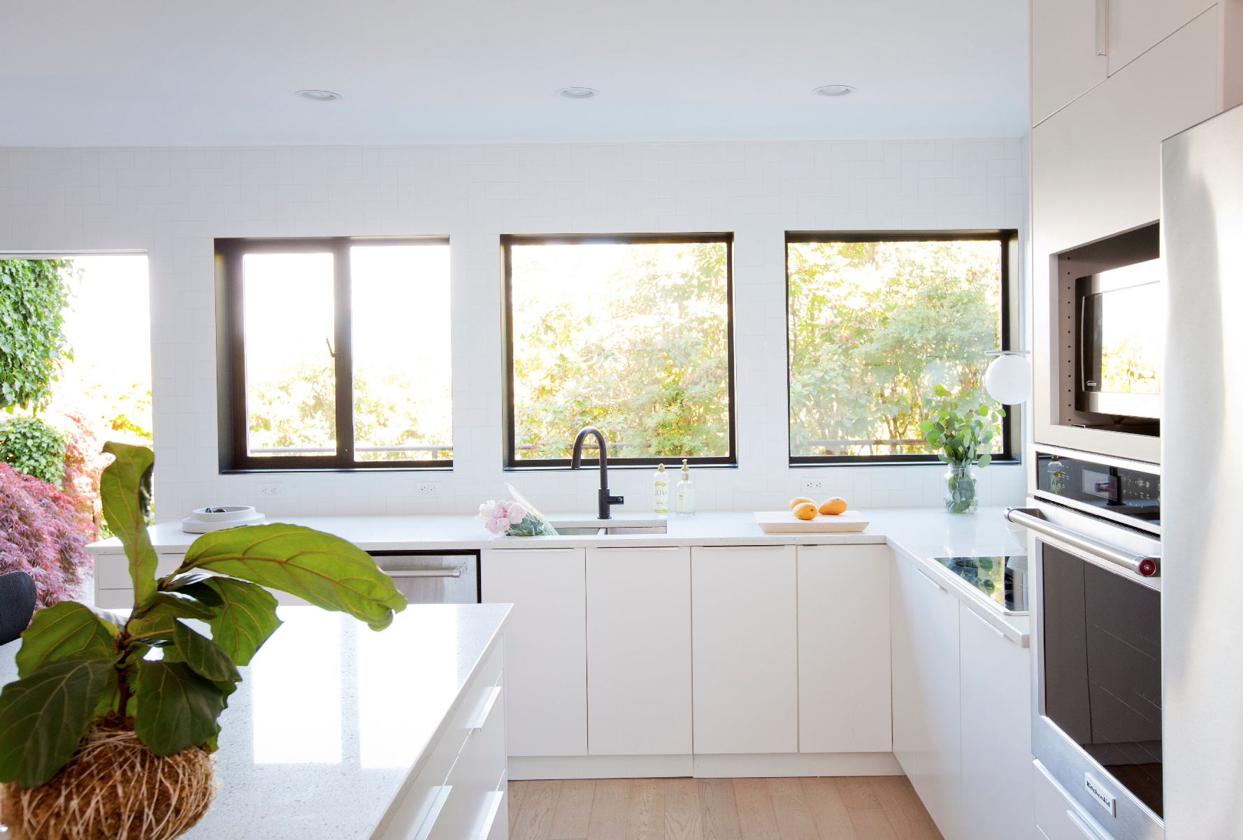
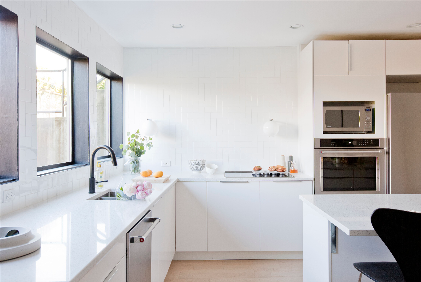
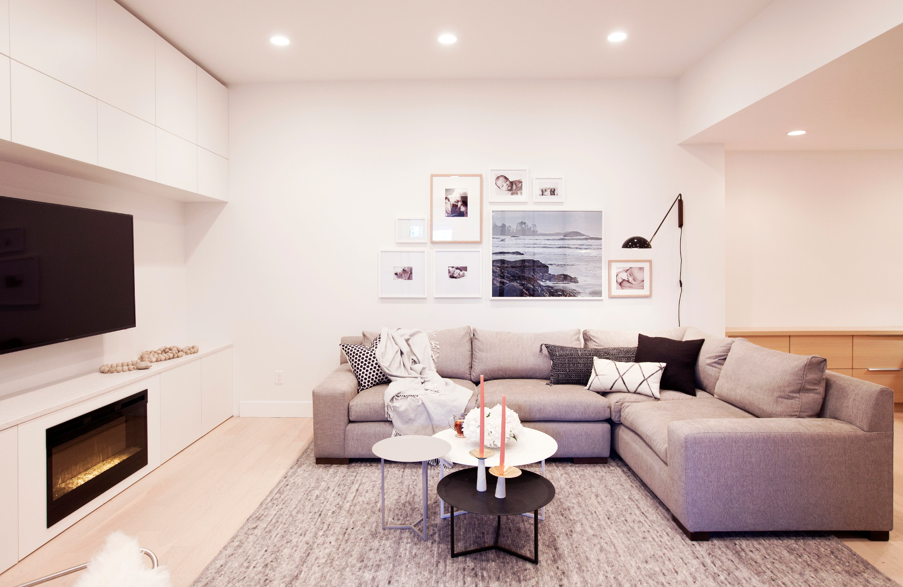
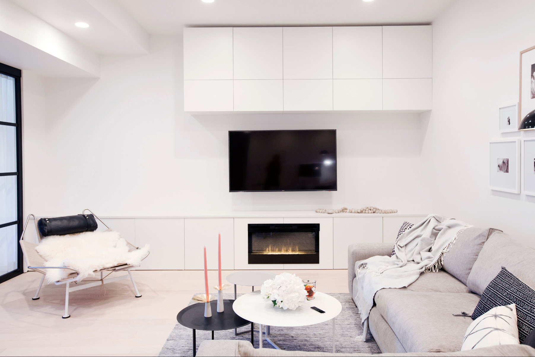
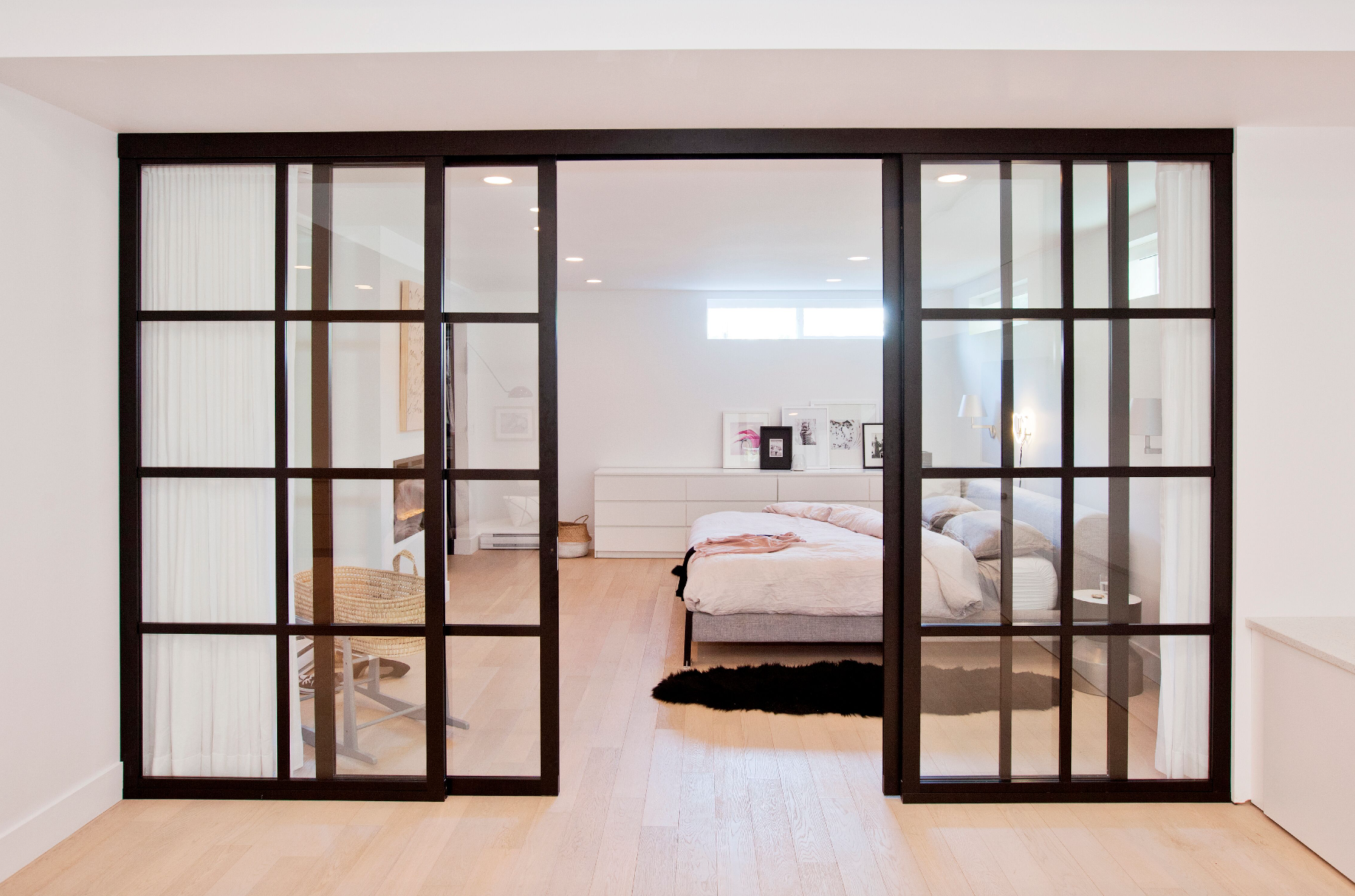
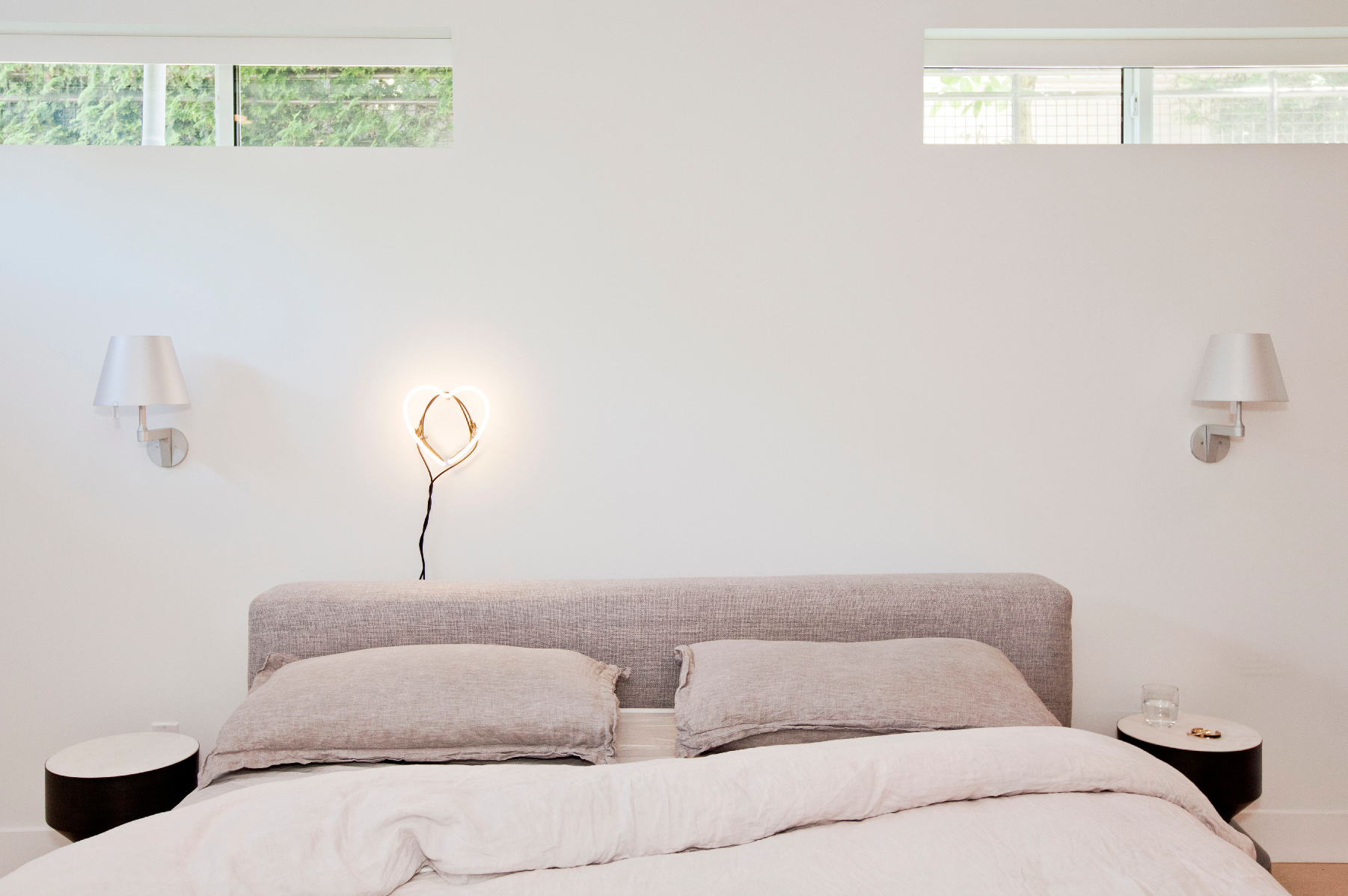
For this renovation, it was all about location. Opting to situate the kitchen where many would think to locate the living space – the front of the house with all the windows – made an unexpected major difference to everyday life for the family considering it is the highest traffic room during daylight hours. Maximizing the space’s brightness in the kitchen and eating areas meant that Robinson had to get creative when looking to design a living room that didn’t feel like a cave; rather than building a traditional wall and door between the living room and master bedroom, a glass sliding wall was installed to allow the natural light from the bedroom carry through into the family space. Floor to ceiling drapery allows for privacy between the rooms when desired, but otherwise an open-concept feel to the suite.
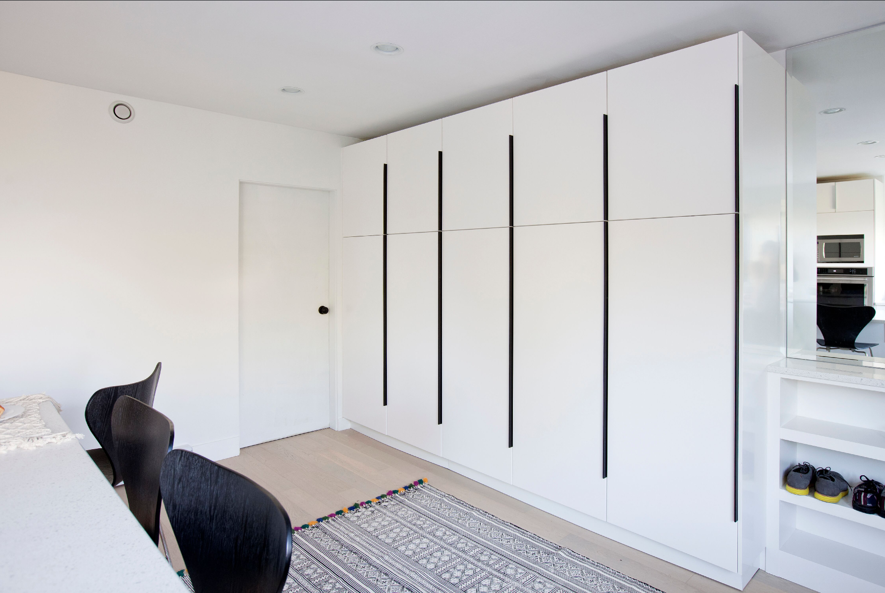
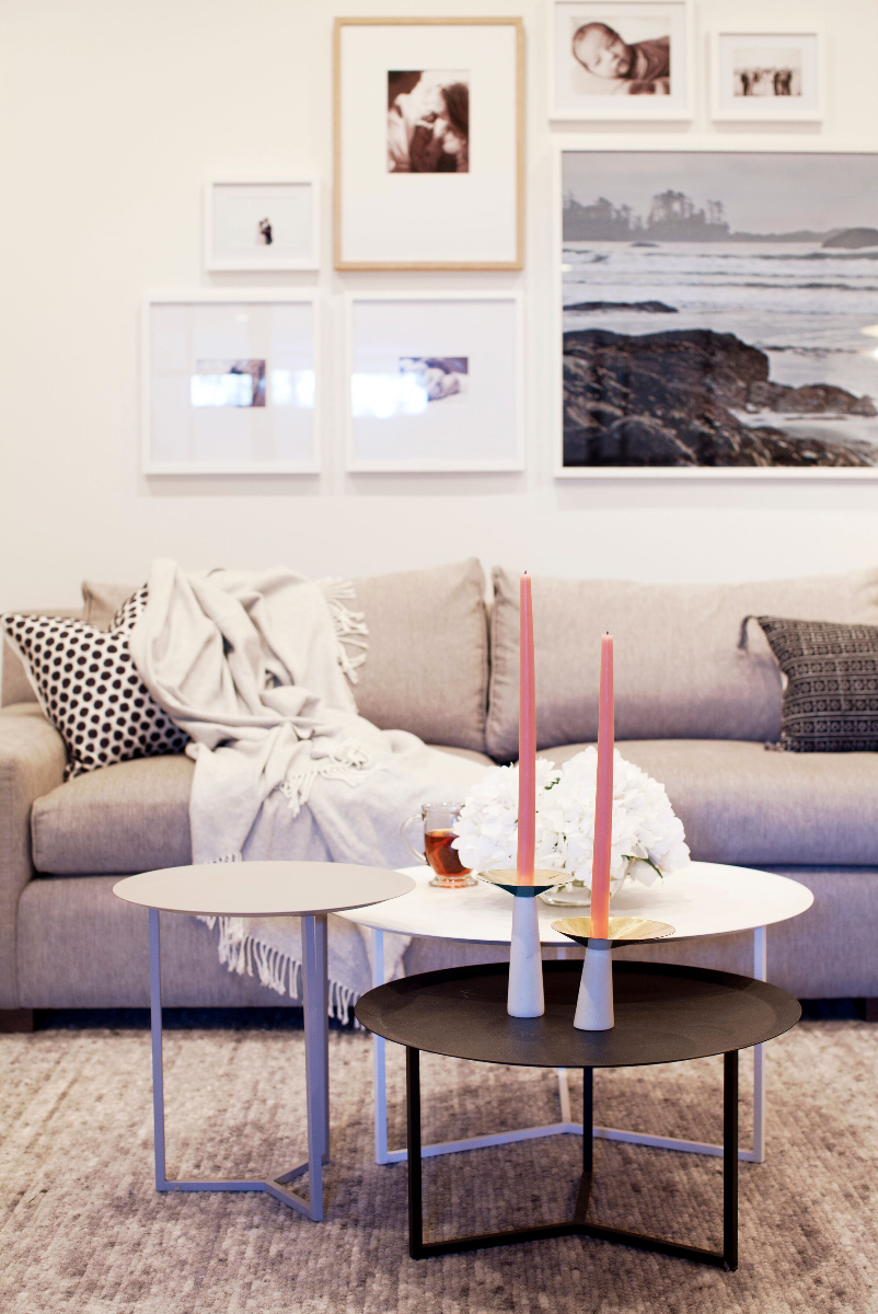
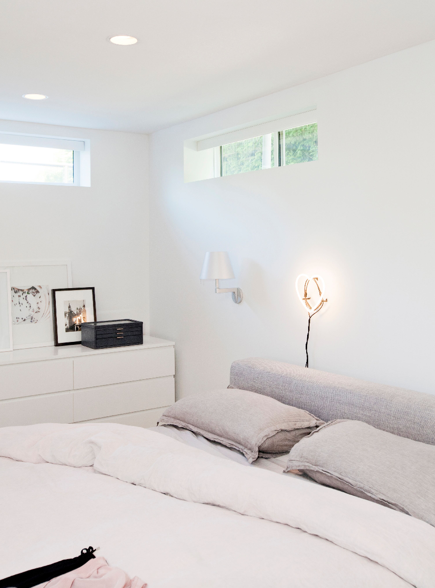
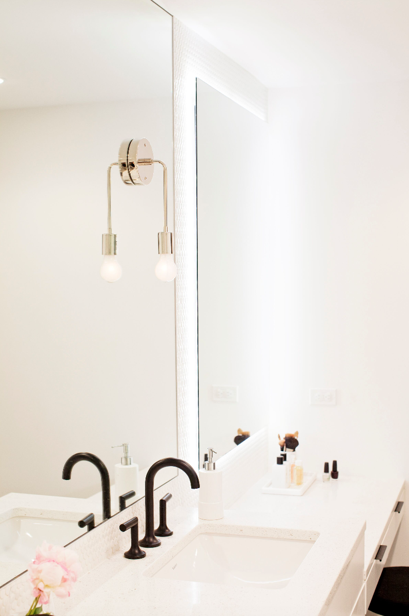
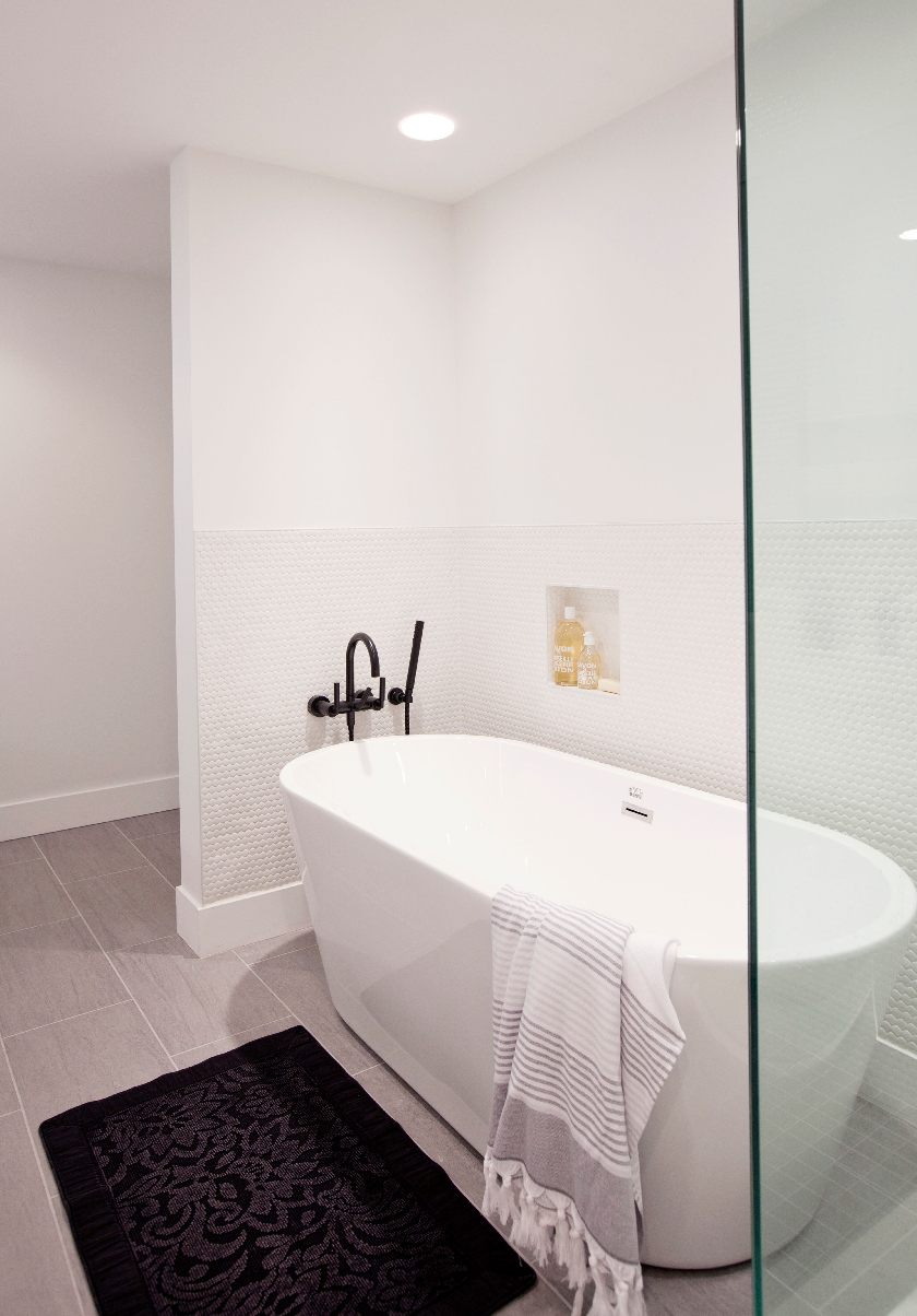
When working with a small space (this unit is 1,200 sq. ft./two bedrooms) and limited natural light, the right colour palette is essential. To keep the space feeling airy with the illusion of more room, Angela went with an all white finish. White walls and cabinetry elevate the feel of the natural light where it is available, and eliminate the enclosed vibe of the areas with no windows. While to some, opting for all-white everything might seem anti-climactic, this space offers a chic graphic appeal as the bright white walls and ceilings are paired with sharp black accents throughout. Sleek black window frames, faucets, hardware and decor details create flow and continuity throughout the space that give depth and interest without overwhelming the suite.
Smaller pops of blues and greens create a tertiary element through the artwork, which becomes a gallery-esque focal point against all white walls. To truly make the space feel personalized without adding clutter, the artwork is family-focused: an all-white-frame gallery wall of family portraits adorns the living room, while statement artwork in the nursery becomes more than just a stellar image, “it’s a photo of the island of Capri, which is the baby’s namesake” Robinson shares.
Through clever spatial planning and creative customized details, the designer was literally able to create a contemporary home-sweet-home out of nothing for this young family.
Comments +